Web Design
Web pages and emails I have worked on in the past from wireframe to coding.
Email revamp – BJ's Wholesale
Working along side an Art Director we were tasked by the leadership team with revamping the email template we use to send out marketing emails. The objective for the assignment were: To cut down on the number of emails sent weekly. Elevate the BJ's brand throughout the email experience. Drive engagement though content and experience, and align the emails to our member mindset calendar.
The end result was then presented to the leadership team and is being implemented in phases which are now a part of our everyday sends.
First Steps
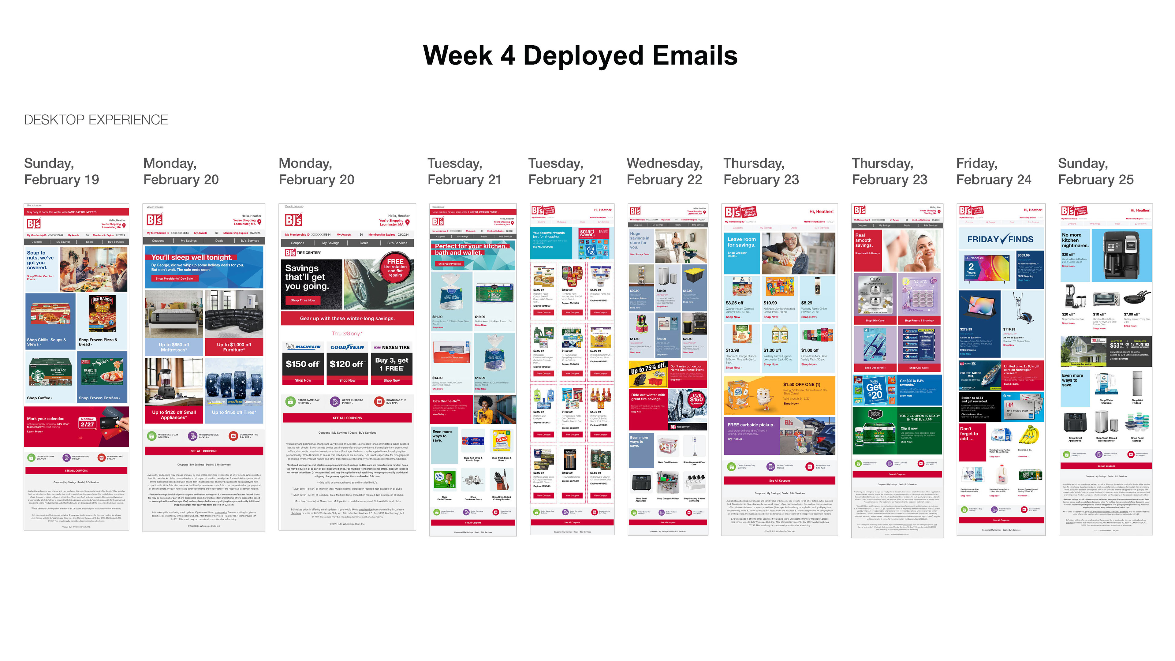
Full scope of emails released in the week of 2/19/23. Sampled emails for designs
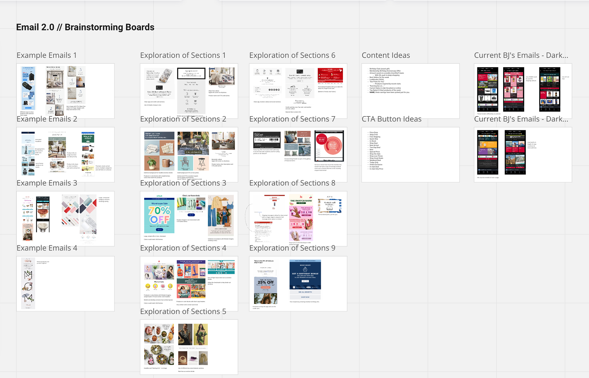
Market research and pain points from original design
The first steps for this assignment was to take a closer look at the emails we were being asked to look at and find any pain points that stuck out to us and write them down. From there we created a Miro board to help us find relevant market research that could help guide the design. We took a look at not only competitors but emails from all scopes from retail to home furnishing to groceries to get a general look and feel for what is out there.
Proposed updates
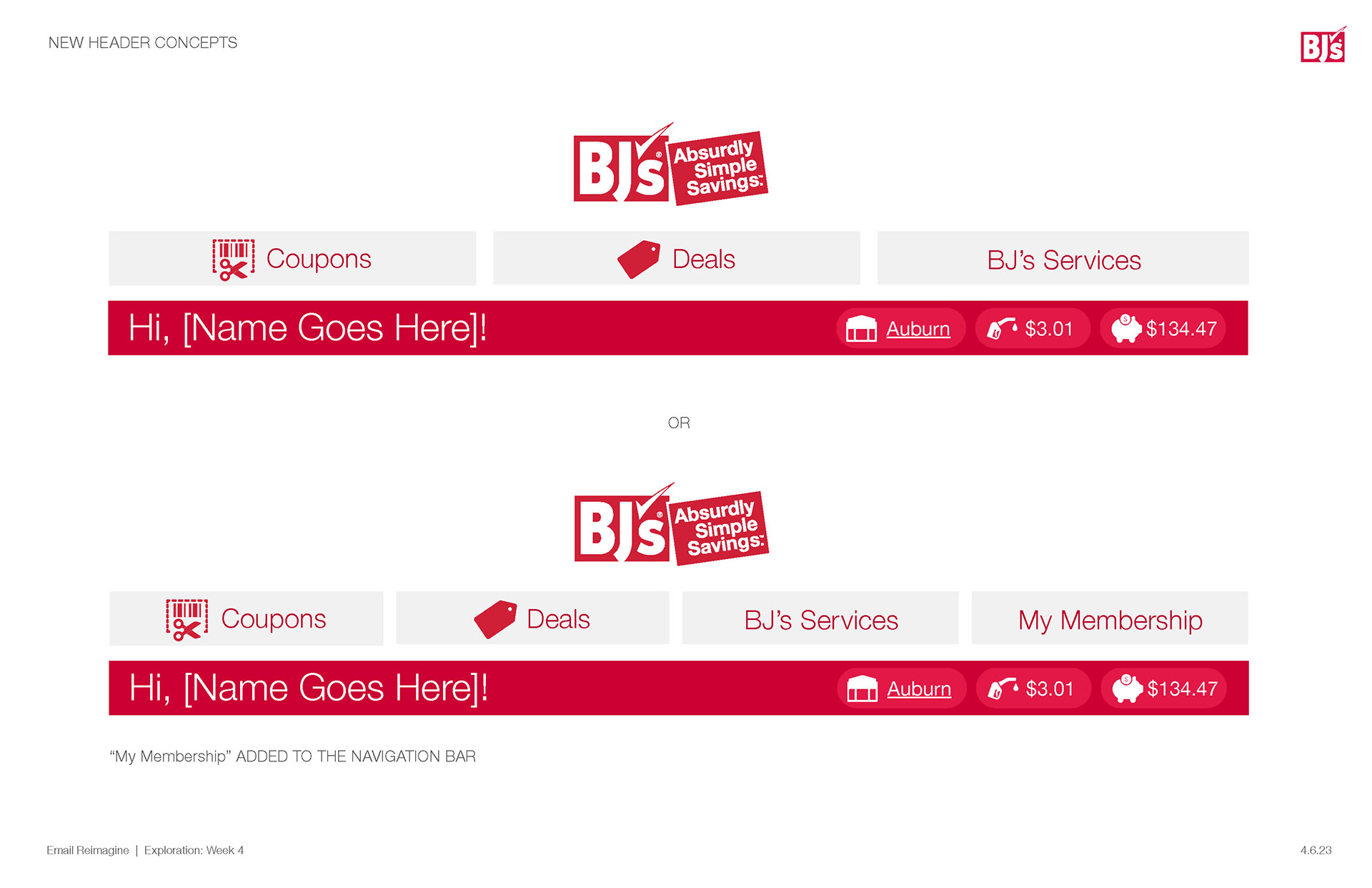
Proposed updated header
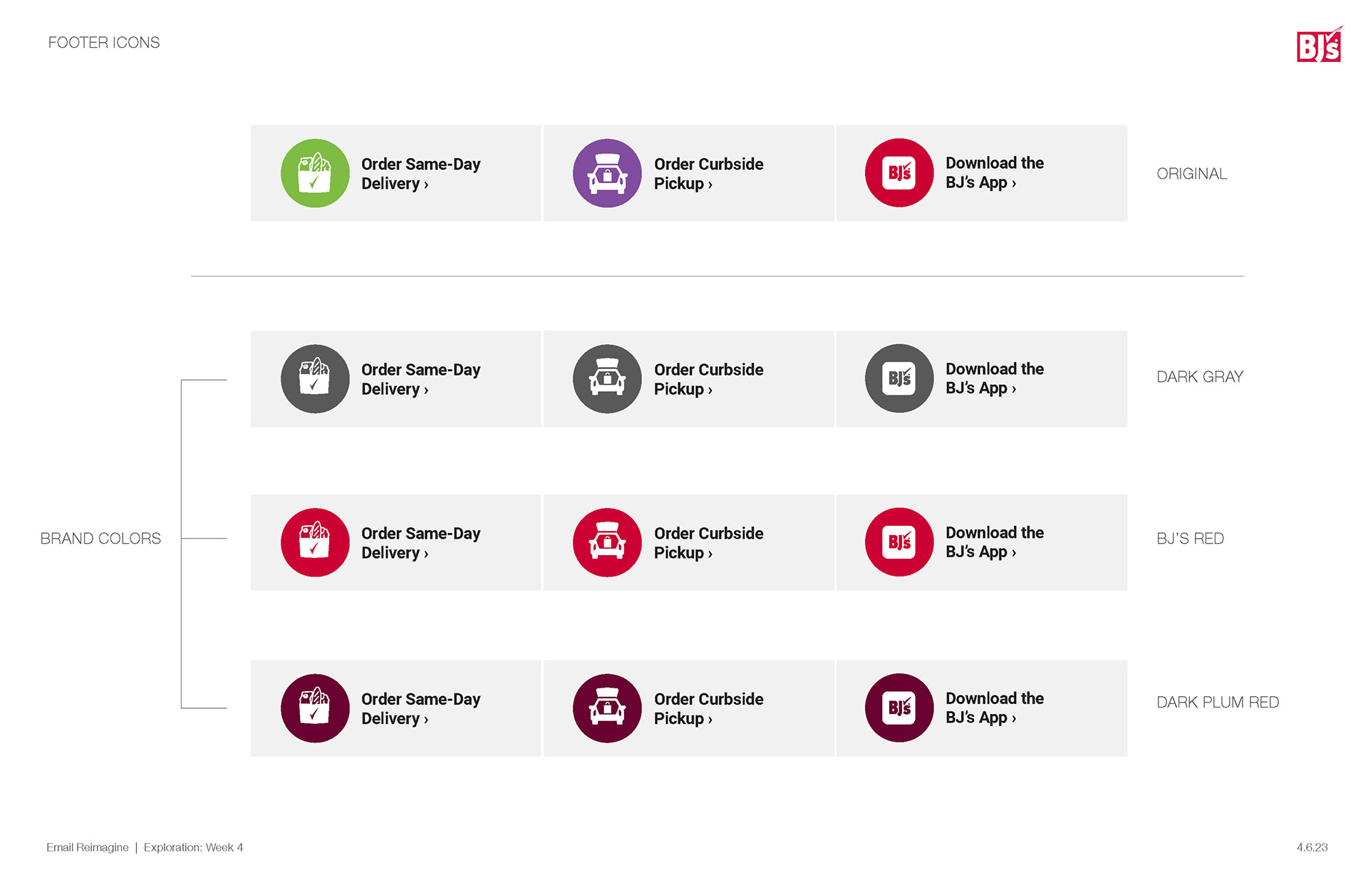
Updating colors to match brand colors
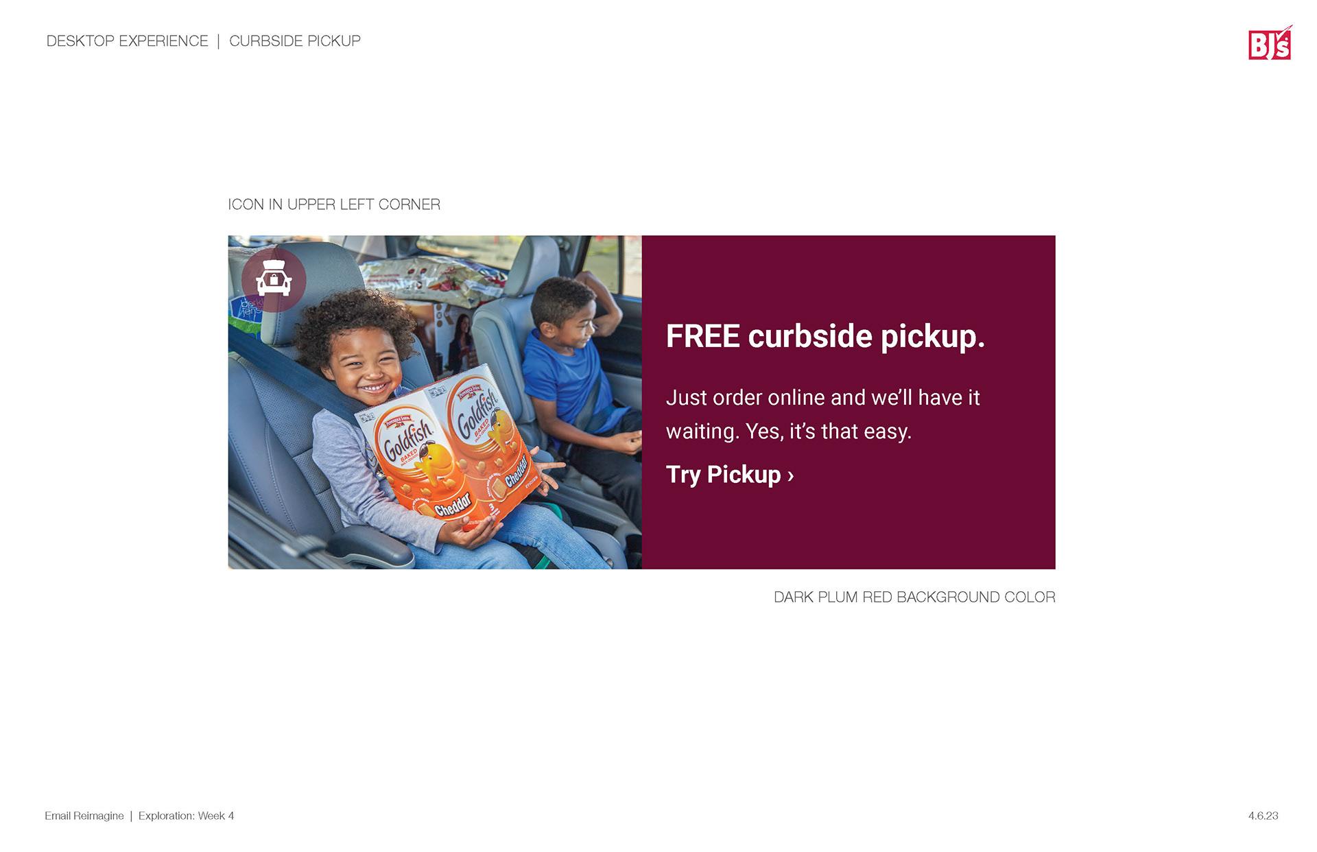
Incorporating brand icons throughout email
Some of the first proposed updates dealt with the issue of branding within the emails. While we looked through the set of previously sent emails we started to see that there were multiple sets of headers, outdated colors, and minimal incorporation of brand elements typically seen in other assets outside of email.
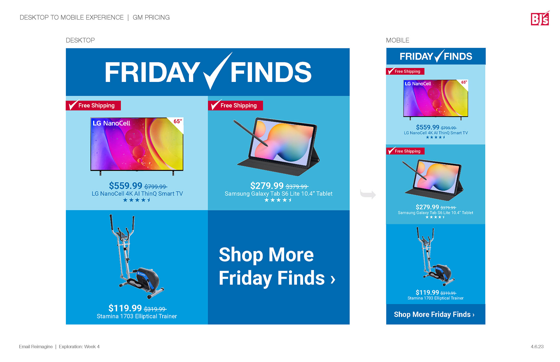
Proposed new sections, call outs, and pricing
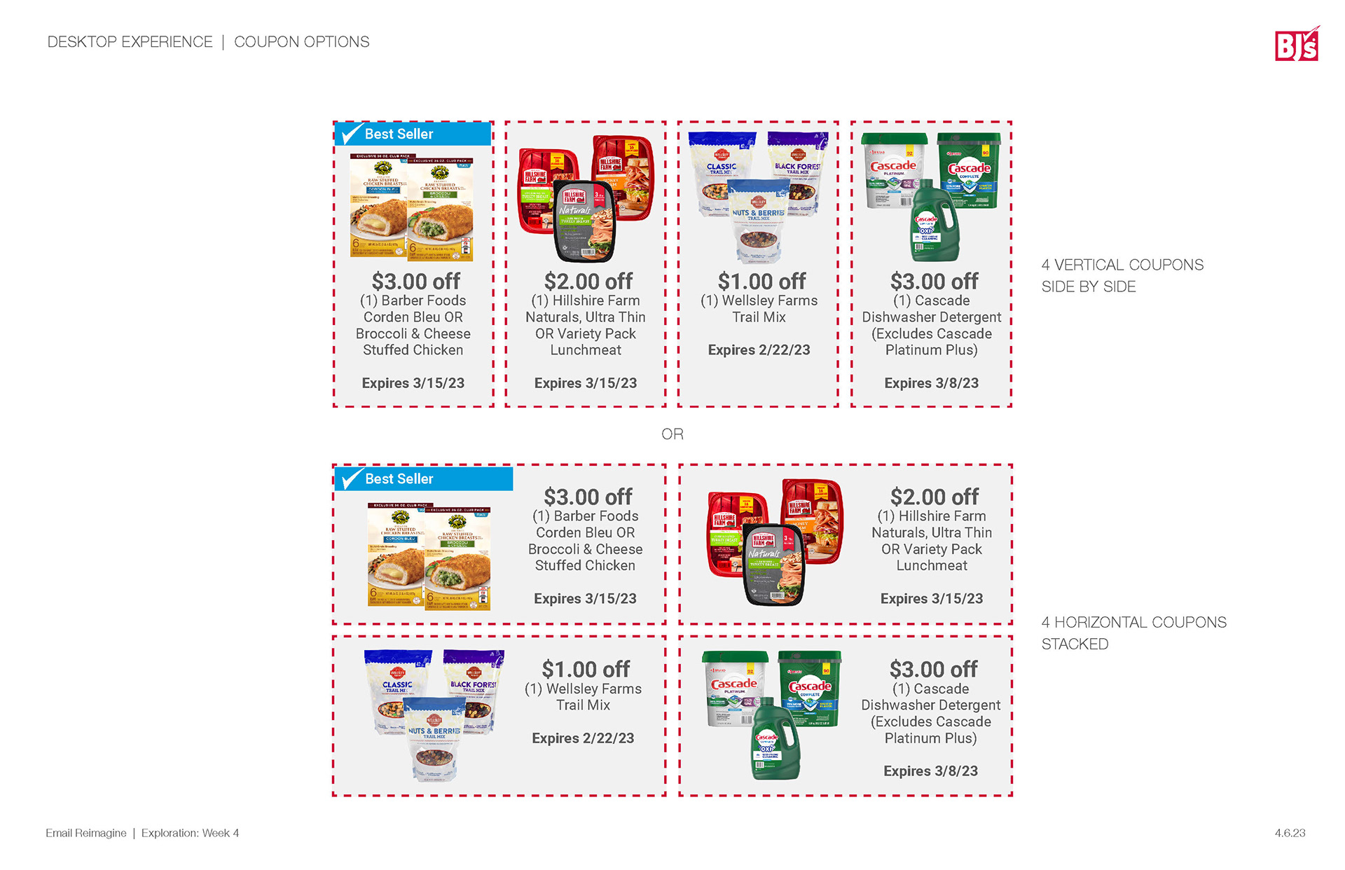
Offer updates
Proposed section layouts
Promotional layout updates
When tackling content we took a look at what each email may need, what are the problem points we see as individuals not designers, pain points we have as designers when asked to do email, and what possible solutions we could come up with. Some of the fundamental issues found were the lack of transitions from categories, lengthy descriptions, and an overwhelming amount of information. Above are some of the solutions we came up with to solve for these problems.
Upper Left: Uses horizontal bars to help establish what category you are currently looking at, we also removed any padding between the boxes in each section to help convey the message that this is a chunk of a story not just singular items grouped together. We added in the use of branded messaging flags that allow the emails to note important messaging such as "Free Shipping", "Best Seller" and more. We also proposed only showing what is important to the member so focusing on sale price instead of amount off, shorter descriptions with only the necessary information, and the use of star rating for higher rated items.
Upper Right: Previous offer emails showed one offer per row which lead to a mile long email that you continuously had to scroll through to look at all offers. We proposed saving some length on those emails and came up with two solutions of what that would look like. One a more conservative option similar to the original just cleaning up some of the design by getting rid of unnecessary items such as the button on each offer and adding in some of the other proposed elements such as the messaging flags.
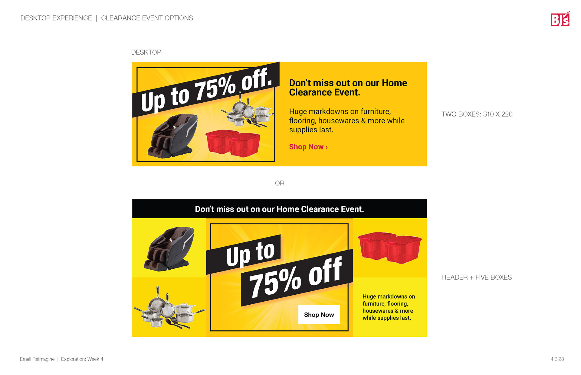
Lower Left: From an internal point of view we wanted to rethink what a promotion call out could look like in an email. The top is what was previously done using an image on the left and text block on the right. We proposed treating it as part of the story narrative adding in a horizontal bar with a headline, sectioning out featured items and allowing the designer to create a more visually impactful central image.
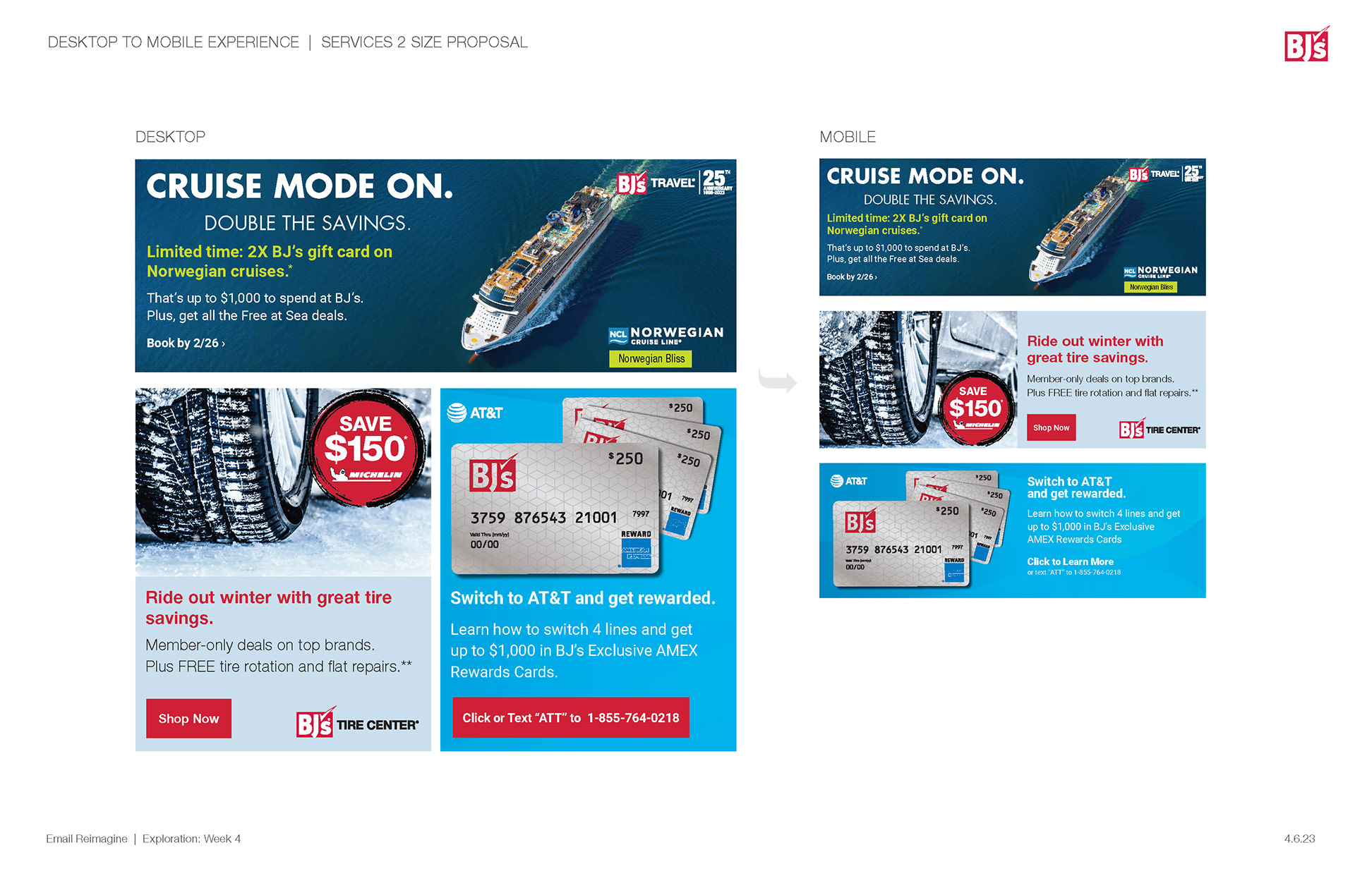
Lower Right: When reorganizing the content into our newly proposed emails we ran into an unexpected issue we were asked to create emails with very little content and more services banner. Seeing as running three banners one after another does not make for a super exciting email and we could not add a headline to a banner we proposed creating a couple of sizing variants to allow the email to still be visually appealing while containing the same amount of content. We proposed keeping the same size we have originally but also allow a 2 column version that would allow content to live next to each other, allowing the viewer to digest the information while not having to continuously scroll though banners.
When presenting to leadership I thought it best to give the full experience to the best of our ability, we used figma to create prototypes for what the emails would look like in a tangible setting to help sell our pitch above you can find both of the prototypes for desktop as well as mobile.
Updated template


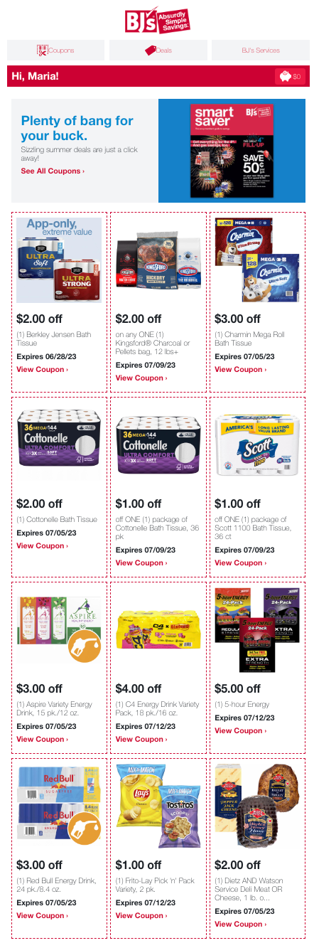
While we are still working to launch some of the updates and troubleshooting others we have launched the new look and feel for email incorporating most of the proposed updates. These are a few example of the first round of updates with the Summer 360 look and feel and Summer Buy more, save more promotion you can see showcased in the Branding section of my portfolio.
Product FEATURE email – WordStream
I was tasked with creating a modular email design that would work to showcase both free tools and product features without a need for two templates. This template was easy to use allowing the person creating the email to add or remove sections as they saw fit.
Re-engagement Newsletter – WordStream
In an effort to re engage previous customers I was asked to design a newsletter with relevant news, upcoming webinars, and blog posts. The email is designed to be modular giving the user the ability to adapt the email to their needs.
Re-engagement Newsletter – WordStream
